
CDN spend forecasts go wrong in a characteristic way: the smooth line hits the real world’s product launches, viral days, pricing tiers and regional drift, and finance stops trusting delivery numbers. The fix is not a better single method but three methods run together — each honest about different things — combined into a band rather than a line. All three run off data you already have if you kept the invoice reviews from the invoice guide.
Why delivery spend resists naive forecasting
Four properties make CDN spend hostile to a ruler and a trendline. It is derivative — spend follows traffic, which follows product decisions made outside your team. It is nonlinear — volume tiers, commit boundaries and overage rates mean cost per GB changes as volume crosses thresholds, so a 20% traffic rise is rarely a 20% spend rise. It is mix-sensitive — the same total GB costs differently as regional and feature mix shifts. And it is spiky — launches and events put walls in the curve that averages smear away. Each method below handles some of these and ignores others, which is exactly why the combination is the answer.
Method 1: trend and seasonality extrapolation
The base layer: take 18–24 months of billed spend and delivered volume, decompose into trend plus seasonality (retail Q4s, media summers — your business has a shape; two years of history reveals it), and extrapolate both, converting volume through your current rate structure rather than extrapolating spend directly — this keeps tier effects honest. Strengths: cheap, objective, hard to argue with as a baseline, and its residuals tell you how noisy your business actually is (which becomes the error band later). Where it lies: at every discontinuity — it cannot see next quarter’s launch, a pricing renegotiation, or a mix shift into premium regions; it forecasts the past’s momentum, nothing else. Use it as the floor of understanding, never the deliverable.
Method 2: driver-based modelling
The explanatory layer: express traffic as drivers the business already forecasts — users or sessions × delivery per session (per product surface: web pages, app API calls, video hours × average bitrate, downloads × size), then through hit-ratio and regional mix to billable GB and requests, then through the rate card to money. The model’s power is conversational: when product forecasts users or a new video feature, your spend forecast updates from their numbers, and when finance asks “why is spend rising?” the answer is a driver, not a shrug. Calibrate each coefficient from measured history (delivery-per-session from logs; mix from invoices) and re-fit quarterly, because coefficients drift — pages get heavier, encodes get better. Where it lies: it inherits every error in the business’s own forecasts, and it tempts false precision — a model with thirty tuned parameters predicts the past perfectly and the future no better than method one. Keep it to the five or six drivers that move real money.
Method 3: event build-up
The spike layer: a calendar of known future events — launches, marquee live events, sale days, marketing pushes, contract changes — each with a delivery estimate built the way event capacity math builds one (audience × payload, honestly), and each priced through the rate card including its tier and overage consequences, because a launch that blows through commit pays overage rates and a forecast that misses that misses the expensive part. This is the method that catches what the other two structurally cannot, and it doubles as the input to capacity planning and provider notifications. Where it lies: events you don’t know about yet, and estimate quality — so keep the calendar owned jointly with product/marketing, and grade past event estimates against actuals to calibrate your own optimism.
Combining them: bands, refresh, and honesty
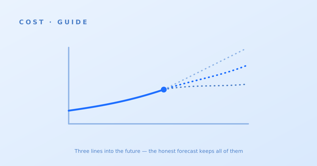
The deliverable is a band, assembled simply: method one’s extrapolation as the base, method two’s driver deltas layered where business forecasts diverge from momentum, method three’s events added as discrete steps — and the band width set from method one’s historical residuals plus your event-estimate error history, presented as central / low / high rather than one false-precision line. Refresh monthly against actuals in the same fifteen-minute review as the invoice, and track your own forecast error over time — a team that knows “we run ±8% at one quarter, ±20% at four” has something finance can plan around, which is the entire point. The band then feeds the two decisions that needed it: commit sizing, which consumes the low edge and the distribution, and budget conversations, which consume the high edge. A forecast nobody consumes is a hobby; wire it to those two and it earns its monthly half hour.